> ## Documentation Index
> Fetch the complete documentation index at: https://docs.contributor.info/llms.txt
> Use this file to discover all available pages before exploring further.
# Distribution Charts
> Spot language concentration risks and see whether contributors are spending effort on high-impact work — so you catch skill gaps and workflow drift before they become blockers.
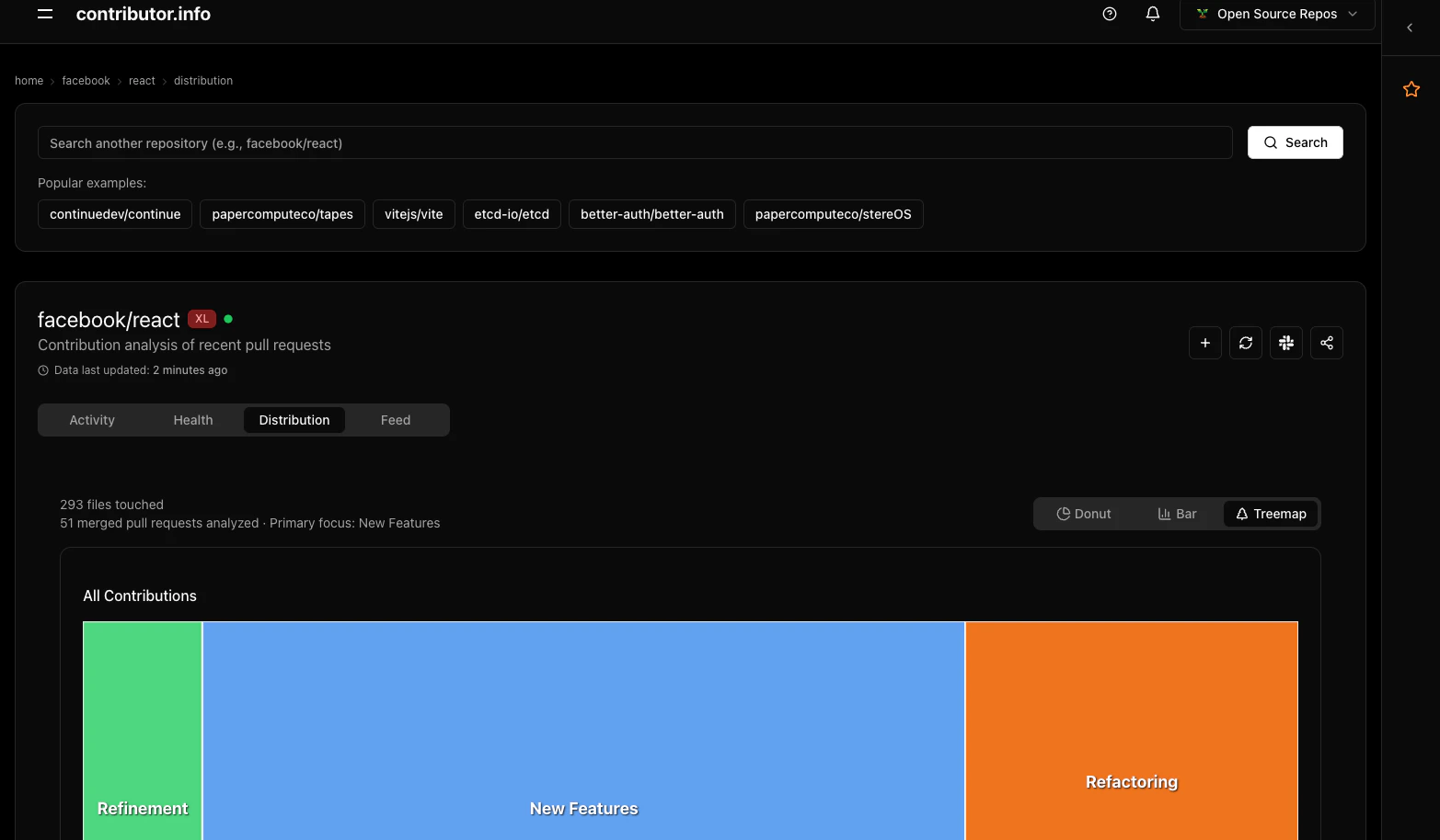
Distribution Charts give you a two-dimensional view of your repository's contribution patterns — what languages contributors work in, and whether that work produces high or low impact. Together these visualizations surface concentration risks and workflow tendencies that raw PR counts miss.
 ## Visualizations
### Language Treemap
The Language Treemap renders each programming language as a rectangle. Rectangle size reflects contribution volume — the more PRs and lines changed in a language, the larger its rectangle. Color identifies the language at a glance.
**How to read it:**
* A single dominant rectangle means most contribution activity is concentrated in one language
* Many similarly-sized rectangles indicate a polyglot codebase with distributed effort
* Click any rectangle to filter other views to that language
**What it shows per language:**
* Number of pull requests touching files in that language
* Total lines changed across those PRs
**Example:**
A repository with a large TypeScript rectangle and a small Python rectangle tells you that contributors are almost entirely working in the frontend. If Python houses your data pipeline, that concentration is worth noting — you may have a knowledge gap.
```
TypeScript ████████████████████ 78% (312 PRs, 24,800 lines)
Python ████ 14% ( 56 PRs, 3,200 lines)
SQL ██ 8% ( 32 PRs, 900 lines)
```
### Contribution Quadrants
The Quadrant chart plots each pull request by two dimensions: **impact** (x-axis) and **effort** (y-axis). This separates the type of work from the volume of work, revealing whether contributors are spending time where it matters most.
| Quadrant | Label | Description |
| --------------- | ------------------------ | -------------------------------------------------------------- |
| 🟢 Top-right | High Impact, High Effort | Major features, significant rewrites, architectural work |
| 🟡 Bottom-right | High Impact, Low Effort | Bug fixes, targeted improvements, small but meaningful changes |
| 🔵 Top-left | Low Impact, High Effort | Documentation, tests, refactoring, infrastructure |
| ⚪ Bottom-left | Low Impact, Low Effort | Minor tweaks, typo fixes, dependency bumps |
**How to read it:**
* A cluster of PRs in 🟢 means the project is in active feature development
* A cluster in 🟡 suggests a maintenance phase, with contributors closing out bugs efficiently
* A cluster in 🔵 points to a team investing in long-term quality without shipping new behavior
* An even spread across quadrants indicates a balanced, healthy workflow
**Example:**
A project preparing for a major release might show most PRs in 🔵 (Low Impact, High Effort) — tests being added, documentation being written — with a few high-effort feature PRs in 🟢 nearing completion.
## Use Cases
### Identify skill gaps
If a critical language like Go or Rust appears as a small rectangle in the treemap while TypeScript dominates, your contributor base may lack depth in the languages that power your core services. This is a signal to recruit or cross-train.
### Find expertise concentrations
A language rectangle that is large but tied to a single contributor's PRs represents a bus-factor risk. Cross-reference with the [Lottery Factor](/features/lottery-factor) to see if that language concentration overlaps with contributor concentration.
### Balance maintenance efforts
If the quadrant chart shows almost all work in 🟡 (High Impact, Low Effort) with nothing in 🔵 (Low Impact, High Effort), your team may be shipping fast but deferring tests and documentation. Distribution Charts make that tradeoff visible before it becomes a problem.
### Understand workflow patterns
A stable open-source project often shows a consistent band of 🔵 work alongside occasional 🟢 spikes during feature cycles. Deviations from your project's normal pattern — a sudden surge of ⚪ trivial commits, for instance — are worth investigating.
## Data Window
Distribution Charts analyze the last **30 days of activity**. This window reflects current contributor behavior rather than historical patterns, so the charts update as your team's focus shifts.
## Visualizations
### Language Treemap
The Language Treemap renders each programming language as a rectangle. Rectangle size reflects contribution volume — the more PRs and lines changed in a language, the larger its rectangle. Color identifies the language at a glance.
**How to read it:**
* A single dominant rectangle means most contribution activity is concentrated in one language
* Many similarly-sized rectangles indicate a polyglot codebase with distributed effort
* Click any rectangle to filter other views to that language
**What it shows per language:**
* Number of pull requests touching files in that language
* Total lines changed across those PRs
**Example:**
A repository with a large TypeScript rectangle and a small Python rectangle tells you that contributors are almost entirely working in the frontend. If Python houses your data pipeline, that concentration is worth noting — you may have a knowledge gap.
```
TypeScript ████████████████████ 78% (312 PRs, 24,800 lines)
Python ████ 14% ( 56 PRs, 3,200 lines)
SQL ██ 8% ( 32 PRs, 900 lines)
```
### Contribution Quadrants
The Quadrant chart plots each pull request by two dimensions: **impact** (x-axis) and **effort** (y-axis). This separates the type of work from the volume of work, revealing whether contributors are spending time where it matters most.
| Quadrant | Label | Description |
| --------------- | ------------------------ | -------------------------------------------------------------- |
| 🟢 Top-right | High Impact, High Effort | Major features, significant rewrites, architectural work |
| 🟡 Bottom-right | High Impact, Low Effort | Bug fixes, targeted improvements, small but meaningful changes |
| 🔵 Top-left | Low Impact, High Effort | Documentation, tests, refactoring, infrastructure |
| ⚪ Bottom-left | Low Impact, Low Effort | Minor tweaks, typo fixes, dependency bumps |
**How to read it:**
* A cluster of PRs in 🟢 means the project is in active feature development
* A cluster in 🟡 suggests a maintenance phase, with contributors closing out bugs efficiently
* A cluster in 🔵 points to a team investing in long-term quality without shipping new behavior
* An even spread across quadrants indicates a balanced, healthy workflow
**Example:**
A project preparing for a major release might show most PRs in 🔵 (Low Impact, High Effort) — tests being added, documentation being written — with a few high-effort feature PRs in 🟢 nearing completion.
## Use Cases
### Identify skill gaps
If a critical language like Go or Rust appears as a small rectangle in the treemap while TypeScript dominates, your contributor base may lack depth in the languages that power your core services. This is a signal to recruit or cross-train.
### Find expertise concentrations
A language rectangle that is large but tied to a single contributor's PRs represents a bus-factor risk. Cross-reference with the [Lottery Factor](/features/lottery-factor) to see if that language concentration overlaps with contributor concentration.
### Balance maintenance efforts
If the quadrant chart shows almost all work in 🟡 (High Impact, Low Effort) with nothing in 🔵 (Low Impact, High Effort), your team may be shipping fast but deferring tests and documentation. Distribution Charts make that tradeoff visible before it becomes a problem.
### Understand workflow patterns
A stable open-source project often shows a consistent band of 🔵 work alongside occasional 🟢 spikes during feature cycles. Deviations from your project's normal pattern — a sudden surge of ⚪ trivial commits, for instance — are worth investigating.
## Data Window
Distribution Charts analyze the last **30 days of activity**. This window reflects current contributor behavior rather than historical patterns, so the charts update as your team's focus shifts.