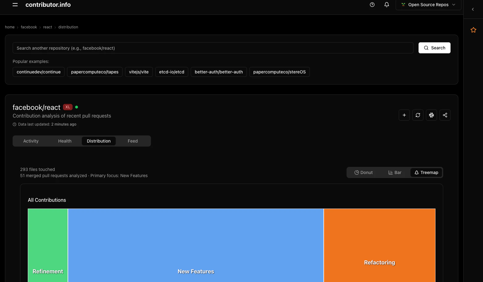
Visualizations
Language Treemap
The Language Treemap renders each programming language as a rectangle. Rectangle size reflects contribution volume — the more PRs and lines changed in a language, the larger its rectangle. Color identifies the language at a glance. How to read it:- A single dominant rectangle means most contribution activity is concentrated in one language
- Many similarly-sized rectangles indicate a polyglot codebase with distributed effort
- Click any rectangle to filter other views to that language
- Number of pull requests touching files in that language
- Total lines changed across those PRs
Contribution Quadrants
The Quadrant chart plots each pull request by two dimensions: impact (x-axis) and effort (y-axis). This separates the type of work from the volume of work, revealing whether contributors are spending time where it matters most.| Quadrant | Label | Description |
|---|---|---|
| 🟢 Top-right | High Impact, High Effort | Major features, significant rewrites, architectural work |
| 🟡 Bottom-right | High Impact, Low Effort | Bug fixes, targeted improvements, small but meaningful changes |
| 🔵 Top-left | Low Impact, High Effort | Documentation, tests, refactoring, infrastructure |
| ⚪ Bottom-left | Low Impact, Low Effort | Minor tweaks, typo fixes, dependency bumps |
- A cluster of PRs in 🟢 means the project is in active feature development
- A cluster in 🟡 suggests a maintenance phase, with contributors closing out bugs efficiently
- A cluster in 🔵 points to a team investing in long-term quality without shipping new behavior
- An even spread across quadrants indicates a balanced, healthy workflow